Tailwind CSS Prototyping: Rapidly Build a Landing Page from Scratch
Introduction
Prototyping is an essential step in web development that helps designers and developers test their ideas quickly and efficiently before committing to a final design. In this article, we will explore the importance of prototyping and how it can help you build better web applications.
The Importance of Prototyping in Web Development
Prototyping allows you to experiment with different design ideas and functionalities, identify potential issues, and refine your design before development begins. This process can save you time and resources in the long run by reducing the risk of costly revisions or redesigns.
Overview of the Article’s Content
In this article, we will use Tailwind CSS to rapidly prototype a landing page from scratch. We will cover the basics of Tailwind CSS and how it can be used to build responsive and visually appealing layouts. We will also explore various prototyping techniques and best practices to help you create effective prototypes. By the end of this article, you will have the knowledge and tools necessary to create your own web application prototypes with ease.
Setting Up the Project
Installing Tailwind CSS:
To start building our landing page with Tailwind CSS, we first need to install it. This can be done by following the installation guide on the official Tailwind CSS documentation.
Also you can read Tailwind CSS Starter guide if you are a beginner and not familiar with tailwind CSS.
Creating the HTML file
Once Tailwind CSS is installed, we can begin creating our HTML file. This file will contain the basic structure of our landing page, including the necessary HTML tags such as <html>, <head>, and <body>.
Adding basic styles with Tailwind CSS
After you’ve created your HTML file, it’s time to add some basic styles with Tailwind CSS. You can do this by adding Tailwind classes to your HTML elements. These classes provide a set of pre-defined styles that you can use to quickly style your landing page.
Creating the Header Section
We used a section element with a class of “relative overflow-hidden”, which may contain other elements for the page content. Within this section, we used a nav element that contains a logo image, a button to toggle a mobile menu, and a list of links to other pages of the website.
The ul element within the nav element is positioned absolutely in the center of the screen using CSS classes such as absolute, left-1/2, and top-1/2. When the screen width is smaller, the ul element changes its display to none and the hamburger button appears. This provides a responsive layout for the navigation bar.
Each li element within the ul element contains an anchor a element that links to a different page on the website, we can add text and svg icon for every li element in ul and changing the bg-color and text-color indicating the current page. Additionally, we added a hidden a element at the end of the nav element that appears only on larger screens, which links to a contact or signup page.
Click on the here to see more details of this section.
    <section class="relative overflow-hidden">
      <nav class="relative flex items-center justify-between bg-gray-50 px-6 py-6">
        <a class="text-3xl font-bold leading-none" href="#">
          <img class="h-12" src="https://play.tailwindcss.com/img/logo.svg" alt="" width="auto"/>
        </a>
        <div class="lg:hidden">
          // mobile menu
        </div>
        <ul class="absolute left-1/2 top-1/2 hidden -translate-x-1/2 -translate-y-1/2 transform lg:mx-auto lg:flex lg:flex lg:w-auto lg:items-center lg:space-x-6">
          // nav menu list
        </ul>
         <a class="hidden rounded-l-xl rounded-t-xl bg-white px-6 py-2 text-sm font-bold text-sky-500 transition duration-200 hover:bg-gray-50 lg:inline-block" href="#">Contact Us</a>
      </nav>
      <div class="relative bg-gray-50 pb-12 pt-12 md:pb-24 lg:pt-20">
        // hero section
      </div>
    </section>
in the next section we will work on features section
Adding the features section
In the “Adding the features section” step, we are adding a new section to our web page that highlights the features of our product or service. To do this, we need to create feature icons and descriptions that showcase what our product or service offers.
Once we have the content for the features section, we will use Tailwind CSS classes to style the section and make it look visually appealing. Tailwind CSS is a utility-first CSS framework that allows us to apply pre-defined classes to our HTML elements to create custom styles without having to write CSS code from scratch.
<section class="overflow-hidden bg-gray-50 py-10">
<div class="container mx-auto px-4">
<div class="rounded-3xl bg-white px-8 py-16 md:px-16">
<div class="-m-8 flex flex-wrap">
<div class="w-full p-8 md:w-1/2">
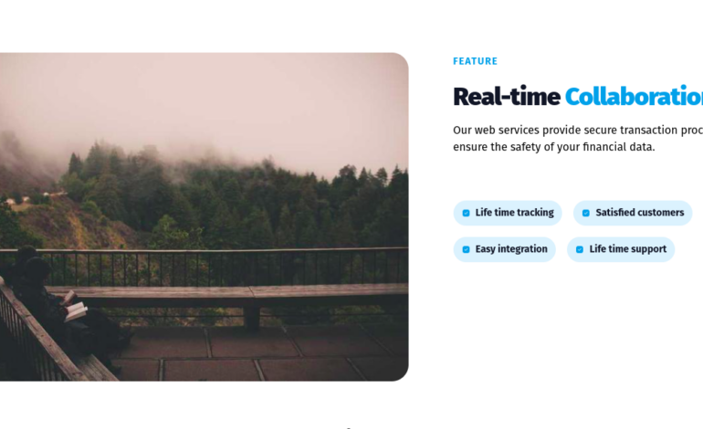
<img class="mx-auto rounded-3xl md:ml-0" src="https://picsum.photos/700/500" alt="" /></div>
<div class="w-full p-8 md:w-1/2">
<div class="md:max-w-md">
<span class="mb-5 inline-block text-sm font-bold uppercase tracking-widest text-blue-500">Feature</span>
<h2 class="font-heading mb-4 text-4xl font-black tracking-tight text-gray-900">
<span>Real-time </span><span class="text-blue-500">Collaboration!</span></h2>
<p class="mb-16 font-normal">Our web services provide secure transaction processing to ensure the safety of your financial data.</p>
<div class="-m-2 flex flex-wrap">
// list of features
</div>
</div>
</div>
</div>
</div>
</div>
</section>
We created a section element which has a class of “overflow-hidden bg-gray-50 py-10”. This means that it will have a light gray background and a padding of 10 pixels on the top and bottom to create some space.
Inside this section, we placed a container element with a class of “container mx-auto px-4”, which centers the content horizontally and adds a padding of 4 pixels on each side.
We also used Tailwind CSS classes to image tag and its container and we have also a header and a paragraph for the title and explanation text.
Also we used -m-2 flex flex-wrap to add a negative margin to the container div that contains list of features.
Click on the here to see more details of feature section code.
Including a call-to-action
A call-to-action (CTA) is a prompt that encourages website visitors to take a specific action. The action could be to subscribe to a newsletter, sign up for a free trial, make a purchase, or any other desired action that aligns with the website’s goals.
<div class="bg-white py-16">
  <div class="container m-auto space-y-8 px-6 text-gray-500 md:px-12 lg:px-20">
    <div class="justify-center gap-6 text-center md:flex md:text-left lg:items-center lg:gap-16">
      <div class="order-last mb-6 space-y-6 md:mb-0 md:w-6/12 lg:w-6/12">
        <h1 class="text-4xl font-bold text-gray-700 md:text-5xl">Experience real-time collaboration with <span class="text-sky-500">our service</span></h1>
        <p class="text-lg">Be part of millions people around the world using tailus in modern User Interfaces.</p>
        <div class="flex flex-row-reverse flex-wrap justify-center gap-4 md:justify-end md:gap-6">
          <button type="button" title="Start buying" class="w-full rounded-xl bg-gray-700 px-6 py-3 text-center shadow-xl transition hover:bg-gray-600 focus:bg-gray-600 active:bg-gray-700 sm:w-max">
            <span class="block font-semibold text-white"> Sign up now </span>
          </button>
          <button type="button" title="more about" class="order-first w-full rounded-xl bg-gray-100 px-6 py-3 text-center transition hover:bg-gray-200 focus:bg-gray-200 active:bg-gray-300 sm:w-max">
            <span class="block font-semibold text-gray-600"> More about </span>
          </button>
        </div>
      </div>
      <div class="grid grid-cols-5 grid-rows-4 gap-4 md:w-5/12 lg:w-6/12">
        <div class="col-span-2 row-span-4">
          <img src="https://picsum.photos/640/960" class="rounded-full" width="640" height="960" alt="" loading="lazy" />
        </div>
        <div class="col-span-2 row-span-2">
          <img src="https://picsum.photos/640/640" class="h-full w-full rounded-xl object-cover object-top" width="640" height="640" alt="" loading="lazy" />
        </div>
        <div class="col-span-3 row-span-3">
          <img src="https://picsum.photos/640/427" class="h-full w-full rounded-xl object-cover object-top" width="640" height="427" alt="" loading="lazy" />
        </div>
      </div>
    </div>
  </div>
</div>
Pricing section
The pricing section of a landing page is typically used to display pricing options for a product or service. This section is important because it provides potential customers with the information they need to make an informed purchasing decision.
<div class="flex min-h-screen flex-col items-center justify-center p-10 text-gray-700 md:p-20">
  <h2 class="text-2xl font-medium">Real-Time Services Membership</h2>

  <div class="mt-8 flex w-full max-w-4xl flex-wrap items-center justify-center">
    <div class="mt-8 flex flex-grow flex-col overflow-hidden rounded-lg bg-white shadow-lg">
      <div class="flex flex-col items-center bg-sky-300 p-10">
        <span class="font-semibold">Basic Plan</span>
        <div class="flex items-center">
          <span class="text-3xl">$</span>
          <span class="text-5xl font-bold">20</span>
          <span class="text-2xl text-gray-500">/mo</span>
        </div>
      </div>
      <div class="p-10">
        <ul>
          <li class="flex items-center">
            <svg class="h-5 w-5 fill-current text-sky-600" xmlns="http://www.w3.org/2000/svg" viewBox="0 0 20 20" fill="currentColor">
              <path fill-rule="evenodd" d="M16.707 5.293a1 1 0 010 1.414l-8 8a1 1 0 01-1.414 0l-4-4a1 1 0 011.414-1.414L8 12.586l7.293-7.293a1 1 0 011.414 0z" clip-rule="evenodd" />
            </svg>
            <span class="ml-2">Real-time updates</span>
          </li>
        </ul>
      </div>
      <div class="justfy-center flex px-10 pb-10">
        <button class="flex h-12 w-full items-center justify-center rounded-lg bg-sky-300 px-6 text-sm uppercase">Order now</button>
      </div>
    </div>

  </div>
</div>
We used “flex” class for the section container. The “min-h-screen” class sets the minimum height of the container to be the height of the screen, ensuring that it takes up the full height of the viewport. The “flex-col” class specifies that the children of the container should be laid out in a column.
The “items-center” class is used to center the child elements horizontally, and the “justify-center” class is used to center them vertically.
We also used for the first div child the utility “flex-wrap” class to specify that child elements should wrap to the next line if they don’t fit on the current line. The “mt-8” class adds a margin of 8 units to the top of the container.
The “overflow-hidden” class is used to prevent the child elements of the container from overflowing outside of the container’s boundaries.
Overall, Tailwind CSS is used extensively to set the styling and responsiveness of the various elements in pricing section. The classes are named in a way that makes it easy to understand their function and purpose, and the use of responsive classes ensures that the layout remains consistent across different screen sizes.
If you want to see the preview of pricing plain click here.
Building the footer section
The footer section is a common area at the bottom of a web page that contains information such as copyright notices, links to important pages, and other related information.
In our example footer section is contained within a div element with a sky blue background color (bg-sky-400) to make it visually distinctive from the rest of the content and also the primary color we used in other sections.
Content of footer
Within the div, the first element is a div with a maximum width of 2xl (max-w-2xl) that contains the actual content of the footer. This content is centered on the page (mx-auto) and has a top and bottom padding of 10 (py-10). The text is white (text-white) to provide a high contrast with the background.
Download our app
The first element within the footer is a div with the class text-center that centers its contents. Within this div, there is a heading with a font size of 3xl (text-3xl) and a bottom margin of 3 (mb-3) to provide some separation from the text that follows. The text within the heading reads “Download our app”.
Below the paragraph, there is a div with the class my-10 that provides a margin of 10 (my-10) to all sides. Within this div, there are two download buttons, each contained within a separate div.
Copyright and privacy policy
Finally, at the very bottom of the footer, there is a div with the classes mt-28, flex, flex-col, items-center, text-sm, and text-white. This div contains two elements: a paragraph with the text “© RealTimer, 2021.” that is centered (items-center) vertically and horizontally (text-center), and a div with the class order-1 (or md:order-2 on larger screens).
This second div contains three links (span elements) that provide information about the company (About us), how to contact them (Contact us), and their privacy policy (Privacy Policy). The links are visually separated by a border on the left (border-l) and a small padding on either side (px-2).
Click here to see the footer section preview
Conclusion
In conclusion, this article has explored the benefits of using Tailwind CSS for rapid web development. We have seen how Tailwind’s utility-first approach allows for quick and efficient prototyping, and how its extensive range of pre-built classes can save developers valuable time and effort.
By utilizing Tailwind’s intuitive syntax, developers can create beautiful and functional designs with ease, and experiment with different styles and layouts until they find the perfect fit for their project.
I encourage readers to try out Tailwind CSS for themselves and experience the benefits of this powerful tool firsthand. With its comprehensive documentation and active community support, Tailwind CSS is the perfect choice for developers looking to streamline their workflow and achieve faster results. So what are you waiting for? Start prototyping with Tailwind today and see how it can transform your web development process!