Tailwind CSS for Beginners: A Comprehensive Getting Started Guide

I.Introduction
Tailwind CSS is a popular utility-first CSS framework that allows you to rapidly build custom user interfaces. Unlike other CSS frameworks, Tailwind doesn’t come with pre-designed UI components but instead focuses on providing a comprehensive set of utility classes that can be combined to create unique designs. This approach makes it a flexible tool that can be customized to fit any design need.
Using Tailwind CSS has several benefits, including faster development and a more consistent design system. By relying on pre-designed utility classes, developers can avoid writing custom CSS and instead focus on building out the functionality of their website or application. Additionally, Tailwind CSS’s utility classes provide a standardized set of styles that can be used across an entire project, ensuring a consistent look and feel.
This guide is aimed at developers who are just starting out with Tailwind CSS, as well as those who are interested in learning how to use Tailwind CSS to build responsive and customization of user interfaces. In the following sections, we’ll go over the basics of setting up Tailwind, using utility classes to style your designs, and advanced techniques for customizing your project.
II. Setting up Tailwind CSS
A. Installation
To use Tailwind CSS, you need to install it first. There are several ways to install Tailwind , including via npm, Yarn, or a CDN. Here, we’ll go through the npm installation process.
To install Tailwind via npm, open your terminal and navigate to your project directory. Then, run the following command:
npm install tailwindcssThis will install Tailwind and its dependencies in your project.
B. Configuration
After installing Tailwind, you need to configure it to customize its default settings or add your own custom styles. You can do this by creating a configuration file called tailwind.config.js in your project root directory.
Here’s an example of a tailwind.config.js file:
module.exports = {
  purge: [],
  theme: {
    extend: {},
  },
  variants: {
    extend: {},
  },
  plugins: [],
};
The purge option tells Tailwind which files to scan for used CSS classes, which helps to reduce the file size of your final CSS output. The theme option is where you can customize your design system, such as colors, typography, spacing, etc. The variants option allows you to enable or disable variants of utility classes, such as hover or focus. The plugins option is where you can add plugins to extend Tailwind functionality.
C. Adding Tailwind CSS to your project
Now that you have installed and configured Tailwind , you can start using it in your project. There are two ways to add Tailwind to your project: via a preprocessor or via PostCSS.
Using a preprocessor
Tailwind can be used with popular CSS preprocessors such as Sass or Less. Here’s an example of how to use Tailwind with Sass:
First, install the sass and sass-loader dependencies:
npm install sass sass-loaderThen, add the following code to your webpack.config.js file:
module.exports = {
  // ...
  module: {
    rules: [
      {
        test: /\.s[ac]ss$/i,
        use: [
          // Creates `style` nodes from JS strings
          "style-loader", // Translates CSS into CommonJS
          "css-loader", // Compiles Sass to CSS
          "sass-loader", // Add this line to use  with Sass
          {
            loader: "sass-resources-loader",
            options: {
              resources: "./src/styles/tailwind.scss",
            },
          },
        ],
      },
    ],
  },
};
Create a tailwind.css file in your project’s src/styles directory with the following code:
// tailwind.config.js file in root directory
@import 'tailwindcss/base';
@import 'tailwindcss/components';
@import 'tailwindcss/utilities';
Then, import the tailwind.scss file into your main index.js file:
import { EthereumProvider } from "@/contexts/EthereumProvider";
import "@/styles/tailwind.css"; // example of importing tailwind.css in next js _app component

function App({ Component, pageProps }) {
  return (
    <EthereumProvider>
      <Component {...pageProps} />
    </EthereumProvider>
  );
}

export default App;
Now, you can start using Tailwind CSS classes in your Sass files.
Using PostCSS in tailwind css
PostCSS is a tool that allows you to transform your CSS using JavaScript plugins. Here’s how to use Tailwind with PostCSS:
First, install the postcss and postcss-cli dependencies:
npm install -D postcss-import
Then, create a postcss.config.js in root directory of your project with the following content:
// postcss.config.js
module.exports = {
  plugins: {
    'postcss-import': {},
    tailwindcss: {},
    autoprefixer: {},
  }
}
D. Using Tailwind CSS with a framework (optional)
If you are using a frontend framework such as React, Vue, or Angular, integrating Tailwind CSS into your project may require some additional steps. Fortunately, there are several resources available that provide guidance on how to set up Tailwind CSS with various frameworks.
For example, the official Tailwind CSS documentation includes a section on how to set up Tailwind CSS with React.
Here is tailwind configuratoin file in next js 13 : tailwind.config.cjs
/** @type {import('tailwindcss').Config} */
module.exports = {
  content: [
    "./app/**/*.{js,ts,jsx,tsx,mdx}", // Note the addition of the `app` directory.
    "./pages/**/*.{js,ts,jsx,tsx,mdx}",
    "./components/**/*.{js,ts,jsx,tsx,mdx}",

    // Or if using `src` directory:
    "./src/**/*.{js,ts,jsx,tsx,mdx}",
  ],
  theme: {
    extend: {},
  },
  plugins: [],
}
Overall, integrating Tailwind CSS with a frontend framework can take some additional setup time, but the benefits of using Tailwind CSS for streamlined styling and improved productivity make it well worth the effort.
Now that we have covered setting up Tailwind CSS, let’s move on to the basics of using Tailwind CSS in the next section.
III. The Basics
A. Utility classes
Tailwind CSS is built around the concept of utility classes, which are small, single-purpose classes that can be combined to build complex styles. The advantage of this approach is that it allows you to write less CSS and focus on building your design.
Utility classes provide a quick and easy way to apply styles to HTML elements. Each class is designed to do one specific thing, such as setting the font size or the background color. You can apply these classes directly in your HTML markup or in your CSS files.
Tailwind CSS provides a wide range of utility classes that cover many aspects of styling, including typography, layout, colors, and more. For example, to set the font size of a text element, you can use the text- prefix followed by the size value, such as text-sm for small text or text-2xl for extra large text.
Here are some examples of commonly used utility classes:
bg-gray-200: //sets the background color to a light gray shade
text-red-500: //sets the text color to a shade of red
px-4: //sets horizontal padding to a value of 4
py-2: //sets vertical padding to a value of 2
mx-auto: //centers an element horizontally using margin auto
text-center: //centers the text horizontally
By combining these classes, you can quickly build complex styles without having to write custom CSS code. In the next sections, we’ll explore some of the advanced features of Tailwind CSS that make it even more powerful.
B. Responsive Design
Responsive design is a crucial aspect of modern web development, and Tailwind CSS makes it easy to create responsive layouts using its built-in utility classes.
When using Tailwind CSS, you can specify breakpoints for different screen sizes, and apply specific styles to elements based on those breakpoints. This ensures that your website or application looks great on all devices, from desktops to mobile devices.
To use responsive design in Tailwind CSS, you can use utility classes that are specific to different screen sizes. For example, you can use the “sm” class to apply a style only to screens with a width of 640 pixels or higher, and use the “md” class for screens with a width of 768 pixels or higher.
Here are some examples of responsive design utility classes in Tailwind CSS:
"sm:text-lg": //applies a larger font size to text on screens with a width of 640 pixels or higher.
"md:flex": //This class applies the "flex" display style to an element on screens with a width of 768 pixels or higher.
"lg:w-1/2": //This class sets the width of an element to 50% on screens with a width of 1024 pixels or higher.
By using these utility classes, you can create responsive layouts that adapt to different screen sizes and provide a consistent user experience across devices.
C. Customizing styles
Tailwind CSS provides a wide range of pre-defined styles that can be easily customized to suit the needs of your project. There are two main ways to customize styles in Tailwind CSS: using configuration files and creating custom utility classes.
Using configuration files Tailwind CSS allows you to customize your project’s styles by editing a configuration file. The configuration file is used to define various options such as colors, font sizes, spacing, and more. By editing the configuration file, you can change the default values for these options to match your project’s requirements.
For example, you can define a new color palette by adding the following code to your configuration file:
module.exports = {
  theme: {
    extend: {
      colors: {
        primary: "#FF9900",
        secondary: "#336699",
      },
    },
  },
  variants: {},
  plugins: [],
};
In this example, we added two new colors (primary and secondary) to our color palette. These colors can now be used in our HTML markup by using the corresponding utility classes (text-primary, bg-primary, etc.).
Creating custom utility classes Tailwind CSS also allows you to create custom utility classes to apply styles that are not covered by the pre-defined utility classes. Custom utility classes can be created by using the @layer directive in your CSS or Sass files.
For example, if you want to create a custom utility class to add a border to an element, you can add the following code to your CSS or Sass file:
@layer utilities {
  .border-3 {
    border-width: 3px;
    border-style: solid;
  }
}
In this example, we created a new utility class called border-3 that adds a solid border with a width of 3 pixels to an element. This new utility class can now be used in our HTML markup by applying the border-3 class to an element.
By using these customization techniques, you can create a unique and tailored design system for your project with ease.
IV. UI Components
In this section, we will cover some of the most commonly used UI components and how to style them using Tailwind CSS. We will look at examples of how to style buttons, forms, and cards using utility classes and custom styles. By the end of this section, you will have a solid understanding of how to use Tailwind CSS to create beautiful and functional UI components for your web applications.
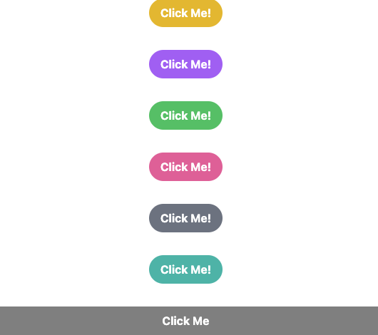
Buttons
Tailwind CSS provides a wide range of utility classes to style buttons in various ways. From solid color-filled buttons to outline buttons, from rounded to pill-shaped buttons, Tailwind CSS offers a vast range of options to choose from.
<button class="bg-blue-500 hover:bg-blue-700 text-white font-bold py-2 px-4 rounded"> Click me </button>This button has a blue background color, white text, rounded corners, and increases in opacity when hovered over. The py-2 and px-4 classes provide padding to the button to make it more visually appealing, while the font-bold class adds bold text.
Forms
 <form className="mx-auto mb-4 max-w-lg rounded bg-white px-8 pb-8 pt-6 shadow-md">
      <div className="mb-6 flex justify-center">
        <img
          className="h-20 w-20 rounded-full object-cover"
          src="https://media.licdn.com/dms/image/C4E03AQGECUq6rb0SBA/profile-displayphoto-shrink_800_800/0/1655222877305?e=1686787200&v=beta&t=9cGk7cd6-jFmQrFWQ5G7FJvp8tvW2rBhEWxVs8OzzeI"
        />
      </div>

      <div className="mb-6">
        <h2 className="mb-2 text-xl font-bold">Login Information</h2>
        <div className="-mx-3 mb-6 flex flex-wrap">
          <div className="w-full px-3">
            <label
              className="mb-2 block text-xs font-bold uppercase tracking-wide text-gray-700"
              for="username"
            >
              Username
            </label>
            <input
              className="mb-3 block w-full appearance-none rounded border bg-gray-200 px-4 py-3 leading-tight text-gray-700 focus:bg-white focus:outline-none"
              id="username"
              type="text"
              placeholder="johndoe123"
            />
          </div>
        </div>
        <div className="-mx-3 mb-6 flex flex-wrap">
          <div className="w-full px-3">
            <label
              className="mb-2 block text-xs font-bold uppercase tracking-wide text-gray-700"
              for="password"
            >
              Password
            </label>
            <input
              className="mb-3 block w-full appearance-none rounded border bg-gray-200 px-4 py-3 leading-tight text-gray-700 focus:bg-white focus:outline-none"
              id="password"
              type="password"
              placeholder="********"
            />
          </div>
        </div>
        <div className="mt-6">
          <div className="grid grid-cols-1 gap-6">
            <div className="flex items-center justify-between">
              <div className="flex items-center">
                <input
                  type="checkbox"
                  name="remember_me"
                  id="remember_me"
                  className="h-4 w-4 rounded border-gray-300 text-indigo-600 focus:ring-indigo-500"
                />
                <label
                  for="remember_me"
                  className="ml-2 block text-sm text-gray-900"
                >
                  Remember me
                </label>
              </div>

              <div className="text-sm">
                <a
                  href="#"
                  className="font-medium text-indigo-600 hover:text-indigo-500"
                >
                  Forgot your password?
                </a>
              </div>
            </div>

            <div>
              <button
                type="submit"
                className="flex w-full justify-center rounded-md border border-transparent bg-indigo-600 px-4 py-2 text-sm font-medium text-white shadow-sm hover:bg-indigo-700 focus:outline-none focus:ring-2 focus:ring-indigo-500 focus:ring-offset-2"
              >
                Sign in
              </button>
            </div>
          </div>
        </div>
      </div>
    </form>
C. Cards
Cards are a commonly used UI component in web design. They are used to display information or content in a compact and organized manner. They are especially useful when you want to group related information together or highlight a specific piece of content.
With Tailwind CSS, styling cards can be done easily using a combination of utility classes. You can add padding, borders, shadows, border radius and so on .
const BlogCard = () => {
  return (
    <div className="max-w-sm overflow-hidden rounded shadow-lg">
      <img
        className="w-full"
        src="https://picsum.photos/300/200"
        alt="Sunset in the mountains"
      />
      <div className="px-6 py-4">
        <div className="mb-2 text-xl font-bold">The Coldest Sunset</div>
        <p className="text-base text-gray-700">
          Lorem ipsum dolor sit amet, consectetur adipisicing elit. Voluptatibus
          quia, nulla! Maiores et perferendis eaque, exercitationem praesentium
          nihil.
        </p>
      </div>
      <div className="px-6 pb-2 pt-4">
        <span className="mr-2 inline-block rounded-full bg-gray-200 px-3 py-1 text-sm font-semibold text-gray-700">
          #mountain
        </span>
        <span className="mr-2 inline-block rounded-full bg-gray-200 px-3 py-1 text-sm font-semibold text-gray-700">
          #sunset
        </span>
        <span className="inline-block rounded-full bg-gray-200 px-3 py-1 text-sm font-semibold text-gray-700">
          #winter
        </span>
      </div>
    </div>
  );
};

export default BlogCard;
Navigation
const Navigation = () => {
  return (
    <nav className="flex flex-wrap items-center justify-between bg-gray-900 p-6">
      <div className="mr-6 flex flex-shrink-0 items-center text-white">
        <img
          className="h-8 w-8 rounded-full"
          src="https://picsum.photos/30/30"
          alt="Logo"
        />
        <span className="ml-2 text-xl font-semibold tracking-tight">
          My Website
        </span>
      </div>
      <div className="block lg:hidden">
        <button className="flex items-center rounded border border-white px-3 py-2 text-white hover:border-gray-500 hover:text-gray-500">
          <svg
            className="h-3 w-3"
            viewBox="0 0 20 20"
            xmlns="http://www.w3.org/2000/svg"
          >
            <title>Menu</title>
            <path d="M0 3h20v2H0V3zm0 7h20v2H0v-2zm0 7h20v2H0v-2z" />
          </svg>
        </button>
      </div>
      <div className="block w-full flex-grow lg:flex lg:w-auto lg:items-center">
        <div className="text-sm lg:flex-grow">
          <a
            href="#"
            className="mr-4 mt-4 block text-white hover:text-gray-500 lg:mt-0 lg:inline-block"
          >
            Home
          </a>
          <a
            href="#"
            className="mr-4 mt-4 block text-white hover:text-gray-500 lg:mt-0 lg:inline-block"
          >
            About
          </a>
          <a
            href="#"
            className="mt-4 block text-white hover:text-gray-500 lg:mt-0 lg:inline-block"
          >
            Contact
          </a>
        </div>
      </div>
    </nav>
  );
};

export default Navigation;
The nav element has a set of utility classes applied to it to create a flexible, responsive design that adapts to different screen sizes. The navigation bar includes a logo image, a website name, and a set of links to different pages.
The logo image is displayed using the h-8 w-8 rounded-full class, which sets the height, width, and border-radius of the image. The website name is displayed using the ml-2 text-xl font-semibold tracking-tight class, which sets the font size, font weight, and spacing.
The mobile menu button is created using the lg:hidden class, which hides the button on larger screens. When the button is clicked, a menu of links is revealed using JavaScript. The menu links are created using the block text-white hover:text-gray-500 lg:inline-block class, which sets the text color and hover color, and adjusts the display for different screen sizes using the lg:inline-block class.
Overall, this example demonstrates the power of Tailwind CSS for creating flexible, responsive navigation bars that work across different devices and screen sizes.
const ProfileCard = () => {
  return (
    <div className="rounded-md bg-white p-6 shadow-md">
      <div className="flex items-center">
        <img
          src="https://media.licdn.com/dms/image/C4E03AQGECUq6rb0SBA/profile-displayphoto-shrink_800_800/0/1655222877305?e=1686787200&v=beta&t=9cGk7cd6-jFmQrFWQ5G7FJvp8tvW2rBhEWxVs8OzzeI"
          alt="Avatar"
          className="mr-4 rounded-full w-16"
        />
        <div>
          <h2 className="text-lg font-semibold">Mohcen Parsa</h2>
          <p className="text-gray-600">Fullstack Developer</p>
        </div>
      </div>
      <div className="mt-4">
        <p className="text-gray-700">
          Passionate Full-Stack #JavaScript and #blockchain dev. Building
          decentralized apps with #Ethereum, #React, #NextJS, #Solidity,
          #Web3JS, #Strapi, and more.
        </p>
      </div>
      <div className="mt-6 flex justify-between">
        <button className="rounded bg-blue-500 px-4 py-2 font-semibold text-white hover:bg-blue-600">
          Read More
        </button>
        <div className="flex items-center">
          <svg
            className="mr-1 h-6 w-6 text-gray-400"
            fill="none"
            stroke="currentColor"
            viewBox="0 0 24 24"
            xmlns="http://www.w3.org/2000/svg"
          >
            <path
              stroke-linecap="round"
              stroke-linejoin="round"
              stroke-width="2"
              d="M15 12a3 3 0 11-6 0 3 3 0 016 0z"
            ></path>
            <path
              stroke-linecap="round"
              stroke-linejoin="round"
              stroke-width="2"
              d="M7.5 8h-3a4.5 4.5 0 014.5-4.5v3a1.5 1.5 0 001.5 1.5h3a4.5 4.5 0 01-4.5 4.5v-3a1.5 1.5 0 00-1.5-1.5z"
            ></path>
          </svg>
          <p className="text-gray-600">24 Comments</p>
        </div>
      </div>
    </div>
  );
};

export default ProfileCard;
Inside the card, there are several div elements that are used to structure the content. The first div element contains an image, the flex and items-center classes are used to align the image and text horizontally.
The second div element the mt-4 class is used to add some spacing between the first and second div elements.
Finally, the third div element contains a “Read More” button and a comment icon with the number of comments displayed next to it. The mt-6 and flex justify-between classes are used to align these elements vertically and horizontally.
Overall, the example code demonstrates how Tailwind CSS can be used to quickly and easily create a professional-looking profile card without writing custom CSS and developers can focus on creating the content and functionality of their websites and applications rather than spending time on styling and layout.
V. Conclusion
In conclusion, Tailwind CSS is a powerful utility-first CSS framework that offers a number of benefits to web developers. By using Tailwind, developers can write less CSS code, create consistent and responsive designs, and build UI components quickly and easily. If you want to learn more about Tailwind, there are a variety of resources available. The official Tailwind website is a great place to start, as it offers extensive documentation, examples, and tutorials. Other resources include online courses, YouTube tutorials, and community forums. Overall, Tailwind is a valuable tool for developers of all skill levels. While there is a bit of a learning curve, once you become familiar with the framework, it can greatly improve your workflow and productivity. By using Tailwind, you can create beautiful and functional web designs with ease, and spend more time focusing on the functionality of your web applications.
If you want to learn more about flex and grid layout and how to apply them using tailwind css, take a look at my article at: https://howtocrackit.com/tailwind-css-flexbox-and-grid-efficient-layout-techniques-for-modern-web-applications
Tailwind documentation – https://tailwindcss.com/docs
GitHub repository for Tailwind – https://github.com/tailwindlabs/tailwindcss


2 Comments
[…] Tailwind CSS is a popular CSS framework that aims to simplify the process of building responsive websites. It provides a comprehensive set of pre-designed CSS classes that can be easily customized to fit the design requirements of any website. […]
[…] If you’re new to Tailwind CSS, it can be helpful to start with my Starter Guide that covers the basics of getting started with Tailwind, including installation, configuration, and using their utility classes for styling. Check it out at: https://howtocrackit.com/tailwind-css-for-beginners-a-comprehensive-getting-started-guide/ […]