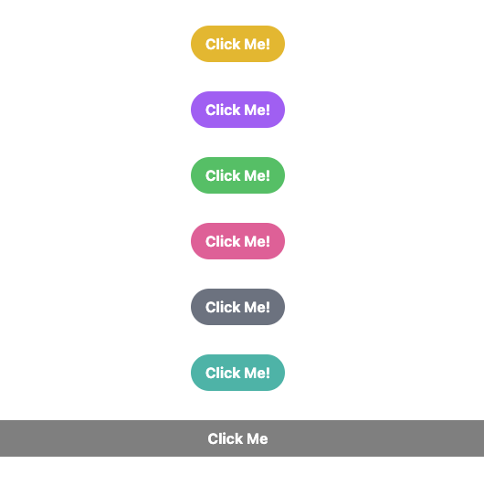
15 Fancy and Simple Tailwind Button for Your Next Project
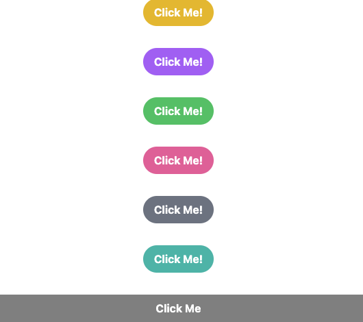
The button styles and animations showcased in this article using Tailwind CSS are a great reference for anyone looking to enhance the interactivity and visual appeal of their website or application. These examples showcase a wide variety of styles and animations that can be easily customized to suit your specific design needs.
To use these examples as a reference, you can take the provided code snippets and tailor them to your own design. You can adjust the colors, gradients, animations, and other properties to create your own unique button styles that fit your brand and design aesthetic.
Additionally, you can use these examples to learn how to use Tailwind CSS classes to create animations and effects. The provided examples demonstrate how to use classes such as hover, transform, and animate to create dynamic and interactive buttons.
Overall, these examples are a great starting point for anyone looking to create visually appealing and interactive buttons using Tailwind CSS. With a little customization, you can create unique and engaging button styles that enhance the user experience on your website or application.
to see list of code sandbox and buttons in action click here
 <div className="my-4" />
      <button className="transform rounded-full bg-red-500 px-4 py-2 font-bold text-white transition duration-500 hover:scale-110 hover:bg-red-600">
        Click Me!
      </button>
      <div className="my-4" />
      <button className="transform rounded-full bg-yellow-500 px-4 py-2 font-bold text-white transition duration-500 hover:animate-bounce hover:bg-yellow-600">
        Click Me!
      </button>
      <div className="my-4" />
      <button className="transform rounded-full bg-purple-500 px-4 py-2 font-bold text-white transition duration-500 hover:rotate-180 hover:bg-purple-600">
        Click Me!
      </button>
      <div className="my-4" />
      <button className="hover:flip-x transform rounded-full bg-green-500 px-4 py-2 font-bold text-white transition duration-500 hover:bg-green-600">
        Click Me!
      </button>
      <div className="my-4" />
      <button className="transform rounded-full bg-pink-500 px-4 py-2 font-bold text-white transition duration-500 hover:scale-90 hover:bg-pink-600">
        Click Me!
      </button>
      <div className="my-4" />
      <button className="hover:shake-x transform rounded-full bg-gray-500 px-4 py-2 font-bold text-white transition duration-500 hover:bg-gray-600">
        Click Me!
      </button>
      <div className="my-4" />
      <button className="transform rounded-full bg-teal-500 px-4 py-2 font-bold text-white transition duration-500 hover:skew-y-6 hover:bg-teal-600">
        Click Me!
      </button>
      <div className="my-4" />
      <button className="content: relative left-0 top-0 h-full w-full transform overflow-hidden rounded-full bg-black bg-opacity-50 px-4 py-2 font-bold text-white transition duration-500 hover:bg-red-600 hover:after:absolute">
        Click Me
      </button>
      <div className="my-4" />
      <button className="transform rounded-full bg-gradient-to-r from-purple-400 via-pink-500 to-red-500 px-4 py-2 font-bold text-white transition duration-500 hover:scale-110 hover:bg-gradient-to-l hover:from-red-500 hover:via-pink-500 hover:to-purple-400 hover:text-white hover:shadow-2xl">
        Click Me!
      </button>
      <div className="my-4" />
      <button className="transform rounded-full bg-black px-4 py-2 text-white transition duration-500 hover:scale-110 hover:bg-blue-500 hover:text-white hover:shadow-2xl hover:ring-2 hover:ring-blue-400">
        Click Me!
      </button>
      <div className="my-4" />
      <button className="transform rounded-full bg-gradient-to-r from-green-400 to-blue-500 px-4 py-2 font-bold text-white transition duration-500 hover:rotate-90 hover:scale-110 hover:bg-gradient-to-l hover:from-blue-500 hover:to-green-400 hover:text-white hover:shadow-2xl">
        Click Me!
      </button>
      <div className="my-4" />
      <button className="transform rounded-full bg-red-500 px-4 py-2 font-bold text-white transition duration-500 hover:scale-110 hover:bg-red-600 hover:text-white hover:shadow-lg hover:ring-2 hover:ring-red-400 hover:ring-opacity-50">
        Click Me!
      </button>
      <div className="my-4" />
      <button className="hover:wave transform rounded-full bg-gradient-to-r from-yellow-500 to-red-500 px-4 py-2 font-bold text-white transition duration-500 hover:scale-110 hover:bg-gradient-to-l hover:from-red-500 hover:to-yellow-500 hover:text-white hover:shadow-2xl">
        Click Me!
      </button>
      <div className="my-4" />
      <button className="transform rounded-full bg-gradient-to-r from-blue-400 to-purple-500 px-4 py-2 font-bold text-white transition duration-500 hover:rotate-45 hover:scale-110 hover:bg-gradient-to-l hover:from-purple-500 hover:to-blue-400 hover:text-white hover:shadow-2xl">
        Click Me!
      </button>
      <div className="my-4" />
      <button className="transform rounded-full bg-gradient-to-r from-pink-500 to-red-500 px-4 py-2 font-bold text-white transition duration-500 hover:skew-y-6 hover:scale-110 hover:bg-gradient-to-l hover:from-red-500 hover:to-pink-500 hover:text-white hover:shadow-2xl">
        Click Me!
      </button>