How to Build a Stunning 3D Scene with React Three Fiber and React Spring
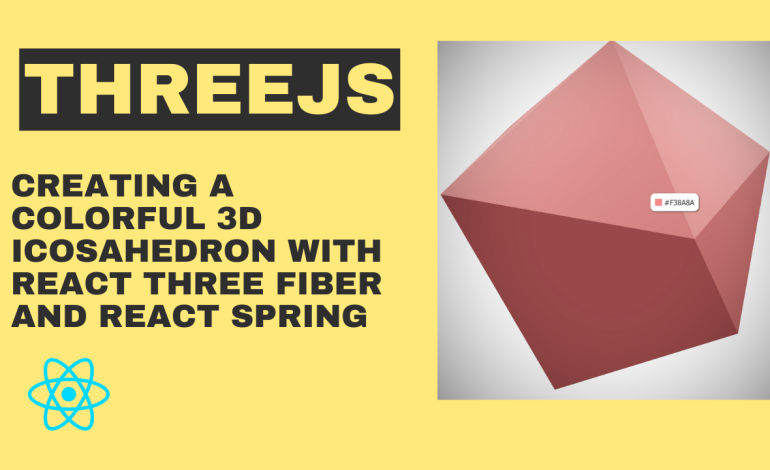
In this tutorial, we’ll be building an interactive 3D scene using React Three Fiber and the Three.js library. Specifically, we’ll be creating a scene with a randomized and changeable color icosahedron, and a tooltip that displays the current colour when the mouse hovers over the icosahedron.
Prerequisites
To follow along with this tutorial, you’ll need:
- Node.js installed on your machine
- Familiarity with React and JavaScript
- Basic knowledge of 3D graphics and Three.js
Step 1: Setting up the Project
To start, create a new React project using create-react-app. In your terminal, run:
npx create-react-app my-3d-sceneThis will create a new React project in a directory called my-3d-scene.
Next, install the following dependencies:
react-three-fiber: A library that makes it easy to use Three.js with React@react-three/postprocessing: A library that provides post-processing effects for Three.jsstyled-components: A library that allows you to create CSS-in-JS styles for your React componentsnice-color-palettes: A library that provides a selection of nice color paletteszustand: A library that provides a simple way to manage global state in your React application
You can install these dependencies using npm:
npm install react-three-fiber @react-three/postprocessing styled-components nice-color-palettes zustandStep 2: Creating the Icosahedron Component
The first component we’ll create is the Thing component, which will render the icosahedron. This component will use the useRef hook to create a reference to the icosahedron mesh, and the useSpring hook from the react-spring/three library to animate the scale and color of the mesh.
Here’s the code for the Thing component:
import { useRef } from 'react';
import { useSpring, a } from 'react-spring/three';
import { useStore } from '../store';

function Thing() {
  const ref = useRef();
  const { color, setColor, hover, setHover } = useStore();
  const { aScale, aColor } = useSpring({
    aScale: hover ? [2.5, 2.5, 2.5] : [2, 2, 2],
    aColor: color,
  });

  return (
    <a.group
      ref={ref}
      scale={aScale}
      onClick={() => {
        setColor(randomColor());
      }}
      onPointerOver={() => setHover(true)}
      onPointerOut={() => setHover(false)}
    >
      <mesh>
        <icosahedronBufferGeometry />
        <a.meshStandardMaterial color={aColor} />
      </mesh>
    </a.group>
  );
}
Let’s go over this code line by line:
const ref = useRef();creates a reference to the icosahedron mesh using theuseRefhook.const { color, setColor, hover, setHover } = useStore();uses theuseStorehook from thezustandlibrary to get the current color of the icosahedron, and to set the color and hoverstate.const { aScale, aColor } = useSpring({ ... })uses theuseSpringhook from thereact-spring/threelibrary to animate the scale and color of the icosahedron. TheaScaleandaColorvariables are used to store the animated values for the icosahedron’s scale and color, respectively. Thehoverstate is used to toggle between two different scale values when the mouse is hovering over the icosahedron.<a.group>...</a.group>creates agroupcomponent from thereact-three-fiberlibrary, which allows us to apply transformations (such as scaling and rotating) to multiple child components at once. We’re using this component to apply the animated scale to the icosahedron mesh.onClick={() => setColor(randomColor())}sets a new random color for the icosahedron when it’s clicked.onPointerOver={() => setHover(true)}andonPointerOut={() => setHover(false)}track when the mouse hovers over and leaves the icosahedron, respectively. These events are used to toggle thehoverstate and animate the scale of the icosahedron.<mesh>...</mesh>creates ameshcomponent from thereact-three-fiberlibrary, which allows us to render 3D geometry with materials. In this case, we’re rendering anicosahedronBufferGeometryand using ameshStandardMaterialwith the animated color value.
Step 3: Creating the Scene Component
The next component we’ll create is the Scene component, which will define the 3D scene and its contents. This component will use the <Canvas> component from the react-three-fiber library to render the 3D scene, and will include two point lights, an ambient light, and the Thing component.
Here’s the code for the Scene component:
import { Fragment } from 'react';
import { Canvas } from 'react-three-fiber';
import { EffectComposer, Vignette } from '@react-three/postprocessing';
import { useStore } from '../store';
import Thing from './Thing';

function Scene() {
  return (
    <Fragment>
      <color args={['white']} attach="background" />
      <pointLight position={[2, 2, 2]} />
      <pointLight position={[-2, 2, 2]} />
      <ambientLight intensity={0.3} />
      <Thing />
      <EffectComposer>
        <Vignette eskil={false} offset={0.2} darkness={0.8} />
      </EffectComposer>
    </Fragment>
  );
}

export default Scene;
Let’s go over this code line by line:
<Fragment>...</Fragment>creates a fragment component, which allows us to render multiple child components without introducing a new parent element.<color args={['white']} attach="background" />sets the background color of the scene to white.<pointLight position={[2, 2, 2]} />and<pointLight position={[-2, 2, 2]} />create two point lights positioned at(2, 2, 2)and(-2, 2, 2), respectively.<ambientLight intensity={0.3} />creates an ambient light with an intensity of0.3.<Thing />renders theThingcomponent we created earlier.<EffectComposer>...</EffectComposer>creates an effect composer component from the `@react-three/postprocessing` library, which allows us to apply post-processing effects to our 3D scene.<Vignette eskil={false} offset={0.2} darkness={0.8} />applies a vignette effect to the scene with theeskil,offset, anddarknessprops used to adjust the appearance of the effect.
Step 4: Creating the Tooltip Component
The final component we’ll create is the Tooltip component, which will display the current color of the icosahedron when the mouse hovers over it. This component will use the styled-components library to create CSS-in-JS styles for the tooltip, and the useStore hook from the zustand library to get the current color of the icosahedron.
Here’s the code for the Tooltip component:
import styled from 'styled-components';
import { useStore } from '../store';

const Tooltip = styled.div`
  display: flex;
  align-items: center;
  background: white;
  position: fixed;
  pointer-events: none;
  z-index: 1;
  transform: scale(${(props) => (props.active ? 1 : 0)});
  transition: transform 0.2s;
  border-radius: 10px;
  box-shadow: 1px 1px 3px #333;
  padding: 10px;
`;

const Swatch = styled.div`
  display: inline-block;
  width: 15px;
  height: 15px;
  background: ${(props) => props.color};
  margin-right: 5px;
  transition: background-color 0.2s;
  box-shadow: 0 0 1px lightgray;
`;

const TooltipLabel = styled.span`
  color: #555;
  font-family: 'Segoe UI', Tahoma, Geneva, Verdana, sans-serif;
`;

function Tooltip() {
  const tooltip = useRef();
  const { color, hover } = useStore();

  const onMouseMove = (e) => {
    tooltip.current.style.left = e.pageX + 20 + 'px';
    tooltip.current.style.top = e.pageY - 10 + 'px';
  };

  return (
    <Tooltip active={hover} ref={tooltip}>
      <Swatch color={color} />
      <TooltipLabel>{color.toUpperCase()}</TooltipLabel>
    </Tooltip>
  );
}

export default Tooltip;
Let’s go over this code line by line:
const Tooltip = styled.divcreates a styled component with CSS styles for the tooltip.const { color, hover } = useStore();gets the current color of the icosahedron and the current hover state from thezustandstore.const onMouseMove = (e) => { ... }tracks the mouse movement and updates the position of the tooltip accordingly.<Tooltip active={hover} ref={tooltip}>...</Tooltip>renders the tooltip component with theactiveprop set to the currenthoverstate, and arefto allow us to update its position with theonMouseMoveevent handler.<Swatch color={color} />renders a small swatch of the current color next to the color label.<TooltipLabel>{color.toUpperCase()}</TooltipLabel>displays the current color of the icosahedron in uppercase.
Step 5: Creating the Store
The useStore hook that we’ve been using in the Thing and Tooltip components references a global store that stores the current color and hover state. We’ll create this store using the `zustand` library.
Here’s the code for the store.js file:
import styled from 'styled-components';
import { useStore } from '../store';

const Tooltip = styled.div`
  display: flex;
  align-items: center;
  background: white;
  position: fixed;
  pointer-events: none;
  z-index: 1;
  transform: scale(${(props) => (props.active ? 1 : 0)});
  transition: transform 0.2s;
  border-radius: 10px;
  box-shadow: 1px 1px 3px #333;
  padding: 10px;
`;

const Swatch = styled.div`
  display: inline-block;
  width: 15px;
  height: 15px;
  background: ${(props) => props.color};
  margin-right: 5px;
  transition: background-color 0.2s;
  box-shadow: 0 0 1px lightgray;
`;

const TooltipLabel = styled.span`
  color: #555;
  font-family: 'Segoe UI', Tahoma, Geneva, Verdana, sans-serif;
`;

function Tooltip() {
  const tooltip = useRef();
  const { color, hover } = useStore();

  const onMouseMove = (e) => {
    tooltip.current.style.left = e.pageX + 20 + 'px';
    tooltip.current.style.top = e.pageY - 10 + 'px';
  };

  return (
    <Tooltip active={hover} ref={tooltip}>
      <Swatch color={color} />
      <TooltipLabel>{color.toUpperCase()}</TooltipLabel>
    </Tooltip>
  );
}

export default Tooltip;
Let’s go over this code line by line:
const useStore = create((set) => { ... })creates a newuseStorehook that uses thecreatefunction from thezustandlibrary. This hook returns an object with the current color and hover state, as well as functions to update these states.color: randomColor()sets the initial color of the icosahedron to a random color.setColor: (color) => set({ color })creates a function that updates the color of the icosahedron.hover: falsesets the initial hover state tofalse.setHover: (hover) => set({ hover })creates a function that updates the hover state.function randomColor() { ... }defines a helper function that returns a random color from a selection of nice color palettes using thenice-color-paletteslibrary.
Step 6: Rendering the App
The final step is to render the App component, which will include the Canvas component from react-three-fiber, the Scene component, and the Tooltip component.
Here’s the code for the App component:
import { Fragment, useRef } from 'react';
import { Canvas } from 'react-three-fiber';
import { useStore } from './store';
import Scene from './components/Scene';
import Tooltip from './components/Tooltip';
import './App.css';

function App() {
  const tooltip = useRef();
  const { hover } = useStore();

  const onMouseMove = (e) => {
    tooltip.current.style.left = e.pageX + 20 + 'px';
    tooltip.current.style.top = e.pageY - 10 + 'px';
  };

  return (
    <Fragment>
      <Tooltip hover={hover} ref={tooltip} />
      <Canvas onMouseMove={onMouseMove}>
        <Scene />
      </Canvas>
    </Fragment>
  );
}

export default App;
Let’s go over this code line by line:
const tooltip = useRef();creates a reference to the tooltip component.const { hover } = useStore();gets the current hover state from thezustandstore.const onMouseMove = (e) => { ... }tracks the mouse movement and updates the position of the tooltip accordingly.<Tooltip hover={hover} ref={tooltip} />renders the tooltip component with thehoverprop set to the currenthoverstate, and arefto allow us to update its position with theonMouseMoveevent handler.<Canvas onMouseMove={onMouseMove}>...</Canvas>renders theCanvascomponent with theonMouseMoveevent handler and theScenecomponent as a child.
Step 7: Running the App
To run the app, navigate to the root directory of the project and run:
npm startThis will start a development server at http://localhost:3000 where you can see the app running in your browser.
Conclusion
In this tutorial, we’ve built a simple 3D scene using react-three-fiber and added interactivity using react-spring and zustand. We also used @react-three/postprocessing to apply a vignette effect to the scene and styled-components to create a tooltip that displays the current color of the icosahedron when the mouse hovers over it.
By combining these libraries, we’ve created an interactive 3D scene that demonstrates how different libraries can be used together to create rich and engaging user experiences. There are many more features and effects that can be added to this scene, so feel free to experiment and build on this code to create your own unique 3D experiences.
if you are intrested to learn about Tailwind and react click here
#Developer #react-three-fiber #react #programming #javascript #threejs
useful links: